

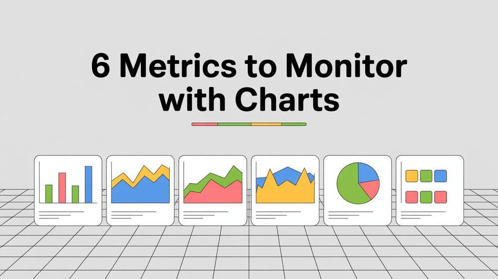
Among the many tools available, JavaScript Charts provide a versatile and dynamic way to present data in an accessible format, enabling users to identify trends, patterns, and anomalies at a glance. This article examines six key metrics that organizations should track using charts, highlighting their significance, effective visualization methods, and practical considerations for implementation with JavaScript-based solutions. By leveraging modern charting libraries, businesses can transform raw data into actionable insights, improving efficiency and strategic planning.
A developer from SciChart, a leading provider of high-performance charting solutions, offers the following insight: “When selecting a charting library, prioritise performance and customisation to handle large datasets effectively. Our platform’s real-time capabilities ensure developers can create responsive, visually rich charts tailored to specific business needs, especially for metrics requiring frequent updates.” This perspective highlights the importance of selecting tools that strike a balance between functionality and ease of use, a theme that resonates throughout the discussion of these metrics.
Revenue Trends Over Time
Tracking revenue trends is fundamental for any organization, as it provides a clear picture of financial health and growth potential. Visualizing revenue data through line charts or area charts allows businesses to observe patterns over weeks, months, or years. These charts can highlight seasonal fluctuations, identify periods of underperformance, or validate the impact of strategic initiatives. For instance, a line chart plotting monthly revenue can reveal whether a marketing campaign led to a spike in sales or if external factors caused a dip.
JavaScript charting libraries, such as Chart.js or Highcharts, excel at rendering smooth, interactive line charts that efficiently handle time-series data. By integrating these tools into a dashboard, businesses can enable users to hover over data points to view precise figures or zoom into specific periods for detailed analysis. Ensuring the chart is responsive is critical, as stakeholders often access dashboards on various devices, from desktops to mobile phones. Customizing the chart with annotations, such as markers for significant events like product launches, enhances its utility by providing context to the data.
To implement this effectively, developers should ensure the data source is clean and structured, with timestamps and revenue values clearly defined. Libraries like ApexCharts support real-time updates, allowing revenue data to refresh dynamically as new figures are recorded. This capability is particularly valuable for e-commerce platforms or subscription-based services where revenue streams fluctuate frequently.
Customer Engagement Metrics
Understanding how users interact with a product or service is crucial for optimizing user experience and driving retention. Customer engagement metrics, such as session duration, page views, or click-through rates, can be effectively visualized using bar charts or heatmaps. For example, a bar chart comparing average session durations across different user segments can highlight which groups are most engaged. At the same time, a heatmap showing click activity on a webpage can pinpoint areas of high interaction.
Libraries like D3.js offer unparalleled flexibility for creating custom visualizations, such as heatmaps, where developers can map user interactions to specific coordinates on a page. For simpler implementations, Recharts, a React-based library, offers pre-built components that integrate seamlessly into web applications, making it easier to display engagement data in a clean and professional format. These tools allow developers to add interactivity, such as tooltips that display detailed metrics when users hover over a bar or heatmap cell.
When designing these charts, consider the audience’s needs and requirements. Marketing teams prefer visually appealing charts with vibrant colors to present to stakeholders, while data analysts prioritize precision and the ability to export data for further analysis. Ensuring accessibility, such as providing text descriptions for screen readers, is also essential to cater to a broad audience, including those with visual impairments.
Operational Efficiency Indicators
Operational efficiency metrics, including production output, downtime, and resource utilization, are crucial for organizations in the manufacturing, logistics, and service industries. Visualizing these metrics using stacked bar charts or gauge charts can provide a clear overview of performance. For instance, a stacked bar chart can show the breakdown of machine uptime versus downtime across multiple facilities, helping managers identify bottlenecks or maintenance needs.
Highcharts are particularly well-suited for creating gauge charts, which can display metrics like resource utilization as a percentage of total capacity. These charts are intuitive, resembling a speedometer, and can be customized to highlight thresholds, such as when utilization exceeds 80%. For developers working with React, libraries like MUI X Charts provide components that align with Material Design principles, ensuring a consistent look and feel throughout the application.
To maximize the effectiveness of these charts, developers should focus on data aggregation. For example, aggregating downtime data by hour or shift can reveal patterns that might be missed in raw datasets. Additionally, incorporating filters that allow users to drill down into specific timeframes or departments enhances the chart’s interactivity and usability. Performance is a key consideration, as operational data often involves large datasets; libraries like SciChart are optimized for rendering thousands of data points without lag, ensuring a smooth user experience.
Website Performance Metrics
For businesses with an online presence, monitoring key website performance metrics — such as page load times, bounce rates, and server response times — is crucial to maintaining a positive user experience. Line charts are ideal for tracking trends in page load times over days or weeks, while pie charts can illustrate the distribution of bounce rates across different pages or user demographics.
Chart.js, a lightweight and beginner-friendly JavaScript charting library, is an excellent choice for rendering these metrics due to its simplicity and support for canvas-based rendering, which ensures fast performance. For more advanced visualizations, Apache ECharts provides options for creating complex charts, such as funnel charts, to visualize user drop-off rates during a checkout process. These libraries support responsive designs, ensuring charts remain legible on smaller screens, which is essential for teams accessing dashboards on tablets or smartphones.
When implementing website performance charts, developers should prioritize real-time updates, as delays in detecting issues, such as slow load times, can impact user satisfaction. Libraries like Nivo, explicitly built for React, offer built-in support for animations and transitions, making it easier to present dynamic data in an engaging way. Additionally, ensuring data accuracy by regularly validating API endpoints or server logs is crucial to avoid misleading visualizations.
Inventory Turnover Rates
For businesses managing physical or digital inventories, tracking turnover rates is essential to optimize stock levels and reduce costs. Inventory turnover can be visualized using area charts to show how quickly stock is sold and replenished over time. For example, an area chart can effectively highlight seasonal trends in inventory turnover, enabling businesses to plan for peak demand periods.
JavaScript Charts, such as those created with Victory, a React-based library, are well-suited for this purpose due to their support for both web and mobile applications. Victory’s component-based architecture allows developers to create reusable chart components, simplifying the process of building dashboards that track multiple inventory metrics. For businesses with complex supply chains, D3.js can be used to create custom visualizations, such as Sankey diagrams, to illustrate the flow of goods between suppliers, warehouses, and customers.
To ensure accuracy, developers should integrate inventory data with real-time stock management systems, using APIs to pull data directly into the charting library. Adding interactive features, such as the ability to filter by product category or region, enhances the chart’s utility for inventory managers. Accessibility considerations, such as high-contrast color schemes, ensure the charts are usable by all team members, including those with color vision deficiencies.
Employee Performance Metrics
Monitoring employee performance metrics, such as productivity rates, task completion times, or sales targets, is vital for human resource management and organizational growth. Bar charts or scatter plots can effectively visualize these metrics, allowing managers to compare performance across teams or individuals. For instance, a scatter plot showing sales targets versus actual sales for each employee can help identify top performers and those who need support.
React-based libraries, such as Recharts or Ant Design Charts, are ideal for creating these visualizations, offering pre-built components that integrate seamlessly into modern web applications. These libraries support animations, which can make transitions between data updates smoother and more engaging for users. For more complex visualizations, such as bubble charts to represent multiple variables (e.g., sales, hours worked, and customer satisfaction), D3.js provides the flexibility to create tailored solutions.
When designing employee performance charts, privacy and clarity are paramount. Avoid displaying sensitive data in a way that could be misinterpreted or accessed inappropriately. Developers should also ensure that charts are easy to interpret, using clear labels and legends to avoid confusion. For teams accessing dashboards on shared devices, implementing role-based access controls within the application can prevent unauthorized data exposure.
Technical Considerations For Chart Implementation
Implementing these metrics effectively requires careful consideration of the technical aspects of JavaScript charting libraries. Performance is a critical factor, particularly when working with large datasets or handling real-time updates. Libraries like SciChart and Chart.js are optimized for speed, using canvas-based rendering to minimize the impact on the DOM. For React developers, libraries such as Recharts and MUI X Charts provide seamless integration with component-based architectures, thereby reducing development time.
Customization is another key consideration. While libraries like Chart.js provide simple, out-of-the-box solutions, others, like D3.js, offer greater flexibility for creating bespoke visualizations. Developers should strike a balance between customization needs and ease of use, as overly complex charts can lead to increased maintenance costs and decreased user adoption. Accessibility features, such as ARIA labels and keyboard navigation, are essential to ensure charts are usable by all audiences, aligning with web accessibility standards.
Data preparation is also critical. Developers should ensure datasets are clean, with consistent formats and no missing values, to avoid rendering errors. For real-time metrics, implementing efficient data pipelines using WebSockets or server-sent events can ensure charts update without performance degradation. Testing charts across various browsers and devices is crucial to ensure compatibility and responsiveness.
Choosing The Right Charting Library
Selecting the appropriate JavaScript charting library depends on the project’s requirements. For small to medium-sized projects, Chart.js and Recharts offer simplicity and ease of integration, making them ideal for rapid development. For larger datasets or complex visualizations, SciChart and D3.js provide the performance and flexibility needed to handle demanding use cases. React developers may prefer libraries like Nivo or Victory for their native integration with React’s ecosystem. At the same time, Highcharts and ApexCharts are suitable for teams needing a wide range of chart types and robust documentation.
When evaluating libraries, consider factors such as community support, documentation quality, and licensing costs. Open-source options, such as Chart.js and Recharts, are free and widely supported, while commercial libraries like Highcharts offer premium features and dedicated support. Testing libraries in a sandbox environment, as suggested by the SciChart developer, can help ensure compatibility with your tech stack before full implementation.
Conclusion
Monitoring key metrics, such as revenue trends, customer engagement, operational efficiency, website performance, inventory turnover, and employee performance, is essential for data-driven decision-making. JavaScript Charts provide a powerful way to visualize these metrics, transforming raw data into insights that are easy to understand and act upon. By selecting the right charting library and focusing on performance, customization, and accessibility, developers can create dashboards that empower businesses to thrive in a competitive landscape. Whether using Chart.js for simplicity or D3.js for bespoke visualizations, the right tools can make all the difference in presenting data effectively.
Do Read: Mastering Cisco AnyConnect VPNs: Implementation and Troubleshooting